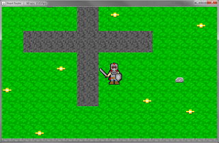
So far I've got a data set of armor, weapons, and animations as far as content that I've loaded via XML files and stored for easy access during run-time. Like the armor, I also had an overlay on the player's sprite for the weapon. Unlike the armor, the weapon overlay also animates with the body, while the armor overlays are just a single frame, though that may change as I introduce more animations for the player. Other than that weapon importing wasn't too bad as I had the armor importing as reference so not too much extra work.
Something I've noticed, pretty much from the beginning, was that there wasn't enough contrast between the player and background causing the player to blend in a little. First thing I tried doing was messing with the level tiles, particularly the ones causing problems with the contrast. That didn't go too well as I figured I'd have to go through all tiles, existing ones and future ones, and test to see how it looks which could take quite a bit of unnecessary time. I decided to come up with a different solution, to give the player a black outline. Originally I thought, I could try maybe adding the outline to the player sprites and any equipment sprites, but that didn't look all too good. So I spent a bit of time combining the pixels of both the player's current frame of animation and any current frames of any equipment animations. Essentially that turned these individual sprites into one single sprite with a single array of pixels, similar to how the Screen class functions by just manipulating whatever pixels it needs to get an image drawn on screen. After combining all the sprites I then created an algorithm to find all transparent pixels that are nearby opaque pixels and set them to the color black, essentially making a black border.
Aside from programming those two things I also added in a few more items and reworked the player sprite a bit, it looked a bit ugly, I think. So I now leave you with some screenshots for the week.
~ Rogue Templar


No comments:
Post a Comment